Easy To Implement Visual Accessibility Features
11 June 2021
Imagine: today is the release date of the game you have been waiting for. Maybe it is Star Citizen, Cyberpunk 2077 or the steam version of Dwarf Fortress. You spend a nice amount of money, download and start it. Once inside the game, you can’t understand the main menu. That’s not a problem, you just guess and somehow manage to start a game. Second disappointment: you can’t see the in-game interface. The game is unplayable. It looks interesting; you devise some features shown in the trailer, but you can’t play it. It is torture.
This is an empathy exercise about what people with visual impairment feel with lots of games. Hopefully, most of the people reading this will not have this problem. Vision related disabilities have a tremendous impact on people’s lives, the least we can do as game developers is to allow them to enjoy our games. At the end that’s the goal of game developers, to create something for others to enjoy.
The report about global data on visual impairments 2010 made by the WHO tells us how many people have moderate or severe vision impairment:
| Ages (years) | Population (millions) | Blind (millions) | Low Vision (millions) | Visually Impaired (millions) |
|---|---|---|---|---|
| 0-14 | 1,848.50 | 1.421 | 17.518 | 18.939 |
| 15-49 | 3548.2 | 5.784 | 74.463 | 80.248 |
| 50-inf | 1,340.80 | 32.16 | 154.043 | 186.203 |
| all ages | 6,737.50 | 39.365 | 246.024 | 285.389 |
That means that 4.24% of the global population is visually impaired (0.58% blind and 3.65% low vision). Although this data does not consider the colour blindness, it should give us a rough idea of how many people will experience visual difficulties when playing our games.
But don’t worry, there is a way to help visually impaired people to enjoy our games: accessible design. During the presentation Accessible Player Experiences: A New Approach to Data Informed Design for Accessible Games done by the The AbleGamers Charity in the 2019 Game Developers Conference, they described accessibility with these words:
Accessibility in games is about getting players having experiences in games alongside their peers.
A more technical definition from The Web Accessibility Initiative, an initiative from the World Wide Web Consortium, defines it as:
Web accessibility means that websites, tools, and technologies are designed and developed so that people with disabilities can use them.
I think you get the idea. So the question now is: How do I make my game accessible? That question is tricky because it is really complicated to make a game 100% accessible for everybody. The conditions of our players can vary a lot and covering all of them can be a huge challenge. We, as indie developers, might not have the resources or experience of AAA game companies, but that’s not an excuse to not to provide some basic accessibility features. In fact, indie games sometimes are the best ones at this, some examples being Hyperdot, Wildfire or Lair of the Clockwork God, all of them with great accessibility features.
In this post my goal is to cover two topics that will make our game way more accessible for the visually impaired people and are really easy to implement: scaling and colour. The key word is easy: low effort, big gains.
GUI Scaling
This is probably the most important accessibility feature. The ability to scale the GUI (Graphical User Interface) makes it easier for the people with low vision. It is based on a really complex principle: the bigger the easier to see. Seems easy, right? You just need to make everything bigger and that’s all. If you have designed interfaces for games before, I am sure you know that what seems easy on the surface ends up being not so much. This post is not about GUI design but I will leave you at the end some interesting posts about the importance of this topic since we usually overlook it.
To continue the explanation, we need to understand the different user interfaces in games. The most common classification is this one:
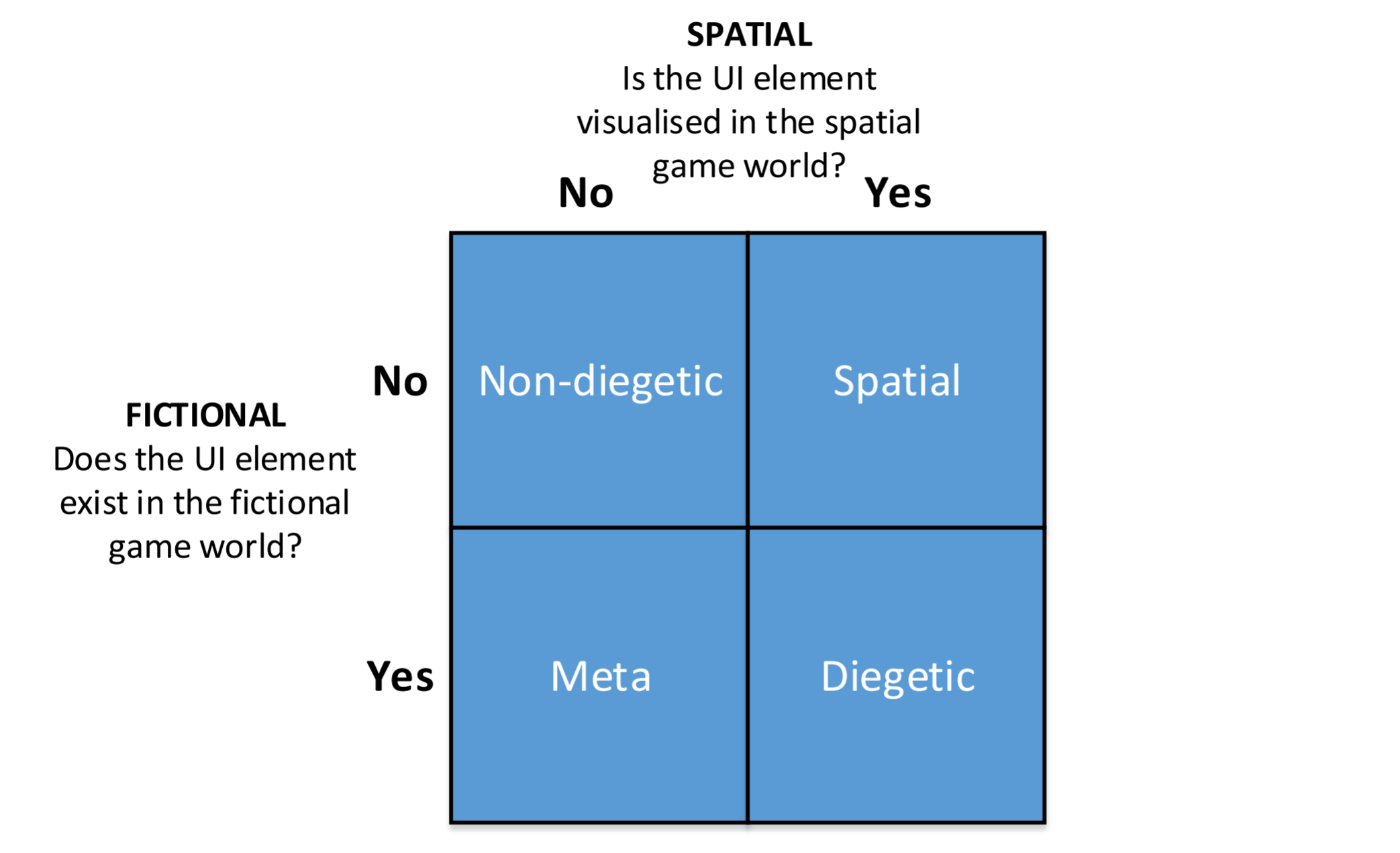
For the sake of this post, we are just going to classify them in two:
-
Non-diegetic: Does not belong to the fictional world. Just the players in the real world can see it.
-
Diegetic: Belongs to the game world. Characters can perceive it.
When making our game interface scalable, we should allow to scale the diegetic and non-diegetic elements independently. Just in case you are not following me: the user should be able to make zoom and scale the buttons without one thing affecting the other, it is not about changing the render resolution. This is useful not just for accessibility but also to adapt our interface to different display sizes and DPIs. I will add another suggestion: allow the text to be scaled independently of the non-diegetic interface (buttons, menus, subtitles, etc.). Depending on our design choices, the buttons and icons might be recognizable enough but not the text. This is specially important for the subtitles.
So far seems simple, right? Believe me, you will have problems. Two elements will collide, the text will get outside its box, some elements will look giant, etc.
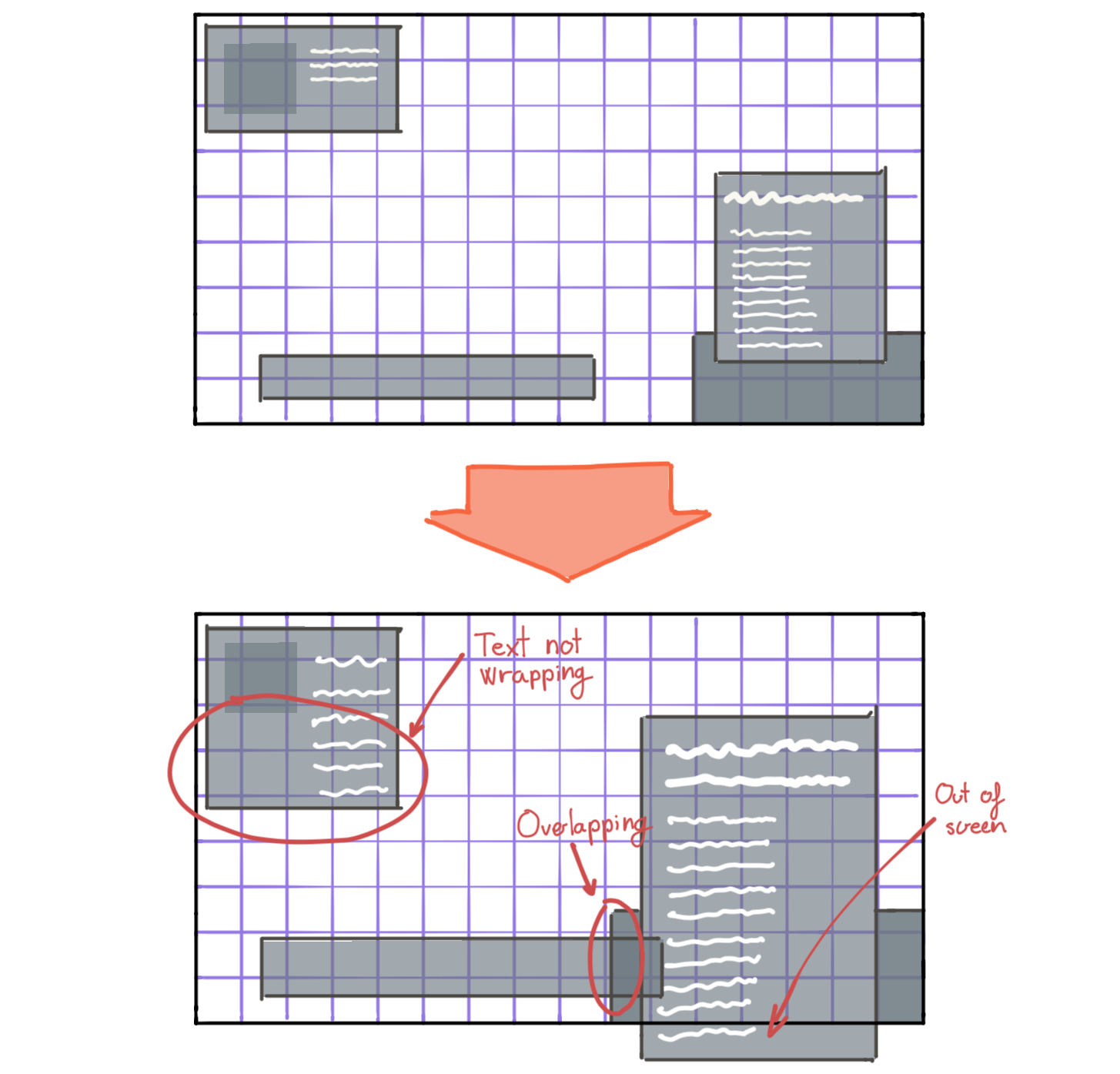
Is a good idea to start the development of the interface with these features in mind. Having the problems shown in the image means the developer did not implement the interface properly, and that, besides the accessibility, it will not look good in all screen sizes and resolutions. If you make a good implementation, you will have moved a big step towards good design and accessibility.
Colours
Sometimes making things bigger is not enough. Some people will have problems if the contrast between the text and the background is too low. To solve this problem, the recommendation is to provide at least two palettes: one of your choice and another one with high contrast. A high contrast palette will help both, people with low vision and with colour blindness. But sometimes this might not be enough. We will start by talking about high contrast.
How much contrast is enough? That is an easy one, 7:1 contrast ratio is enough for most use cases. Let me explain. Any colour (inside a colour space) has what we call relative luminance. Having the relative luminance of two colours, we can calculate the contrast ratio with this formula:
$$ CR = \frac{L1 + 0.05}{L2 + 0.05} $$
Where L1 is the relative luminance of the lighter colour and L2 the relative luminance of the darker colour. In order to calculate the relative luminance we use this formula:
$${\displaystyle L=0.2126R+0.7152G+0.0722B.}$$
But wait, usually we work with gamma-compressed RGB, so first, we have to decompress the RGB values to gamma-expanded values. We can use this easy to remember formula to do that:
$$ {\displaystyle \gamma ^{-1}(u)={\begin{cases}{\frac {u}{12.92}}&={\frac {25u}{323}}&u\leq 0.04045 \newline \left({\tfrac {u+0.055}{1.055}}\right)^{2.4}&=\left({\tfrac {200u+11}{211}}\right)^{\frac {12}{5}}&{\text{otherwise}}\end{cases}}}$$
Where $u$ is ${R}$, ${G}$, or ${B}$.
There must be an easier way… Yes, there is the WebAIM website, which calculates all of this automatically. It also gives you examples of how different text sizes would look with those colours. If you are working with web technologies, I recommend you to use the Stark google chrome extension, which allows you to select text from any web and it will extract the colours and calculate everything. It can simulate vision problems on the entire website too.
Okay, so now we know how to calculate the contrast, but how much contrast is enough contrast? The Web Accessibility Initiative stipulates how much is the minimum and the enhanced color contrast in their reference document. Consider that this was thought for web, but those numbers should work fine for video games.
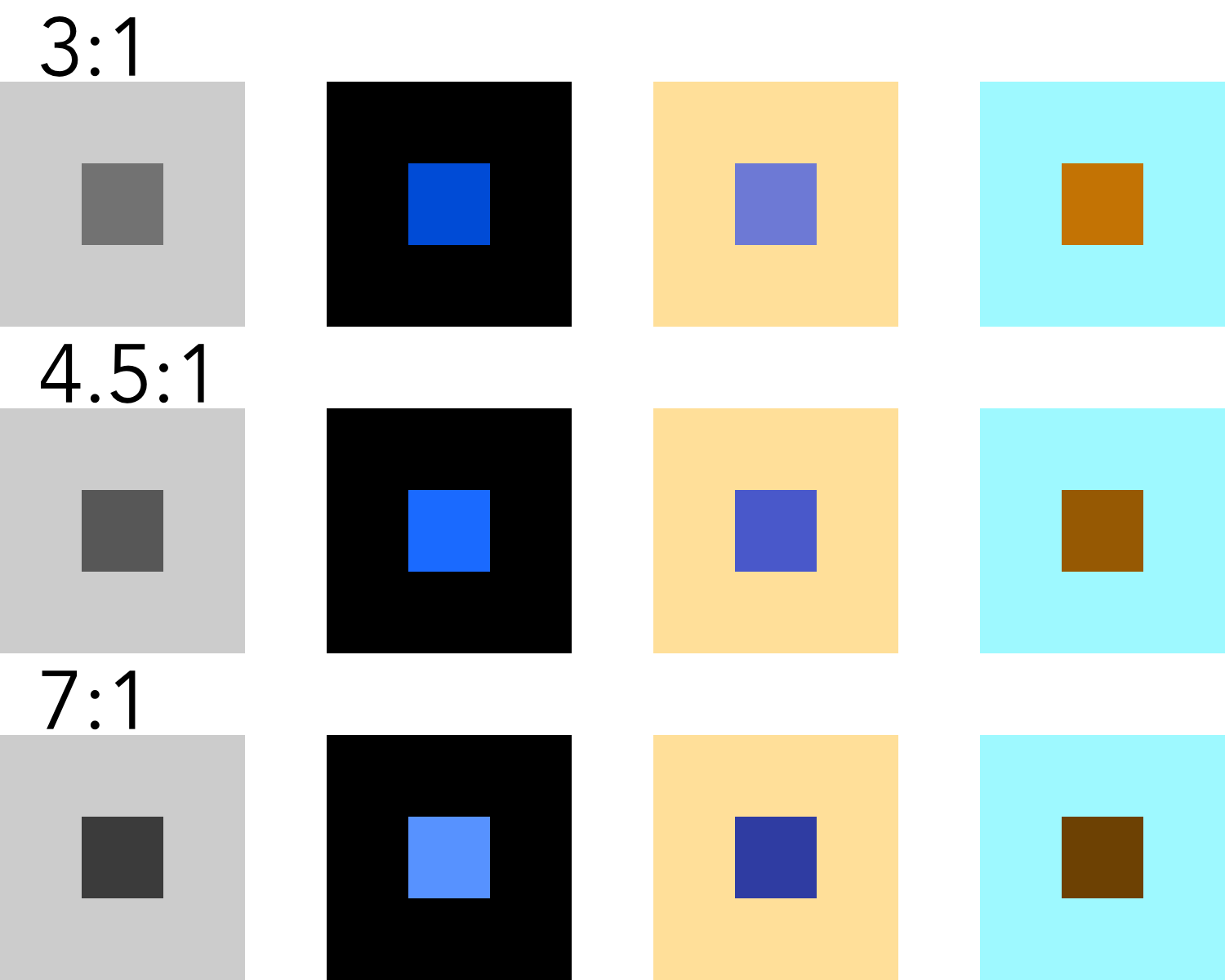
| AA (minimum) | AAA (enhanced) | |
|---|---|---|
| Normal text | 4.5:1 | 7:1 |
| Large text | 3:1 | 4.5:1 |
We have to aim for the AAA. Here there are a few tests that I have done. The background always is the same, but the content changes to archive the desired contrast ratio.
That does not mean that we have to create a palette where every color has a contrast ratio of 7:1 with all the other colours. We have to think about how are we going to use the colours and just worry about the contrast between elements that give information and its background. Quoting the Web Accessibility Initiative about incidental text:
Text or images of text that are part of an inactive user interface component, that are pure decoration, that are not visible to anyone, or that are part of a picture that contains significant other visual content, have no contrast requirement.
That means that we should not worry about the colours whose only purpose is to be used for decorations. But be careful, elements that show information, even if they are not text, deserve high contrast, for example, the lines that organize our UI. Here is an example:
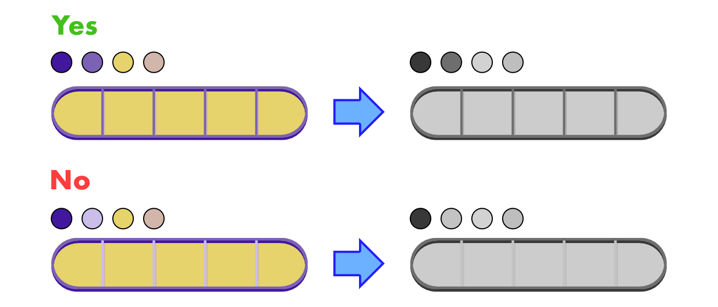
Just one color, used in the vertical separators, has changed. In the first example we see how the shadows disappear, but all the important information still is there. In the second example, the vertical separators disappear. This information is not trivial, so we should avoid designs like this one. Also, it looks like crap.
A high contrast palette might not be enough. This is specially true when colours are meaningful, for example, colours of teams. In these kinds of situations is hard to design with high contrast. What if there are 5 or more teams? Should each one have a different luminance? Thankfully, these situations are not a problem for people with low vision. As far as there is enough contrast between the players and the background they will be able to see properly the shapes. But what happens with colour blind people? Let’s see an example:
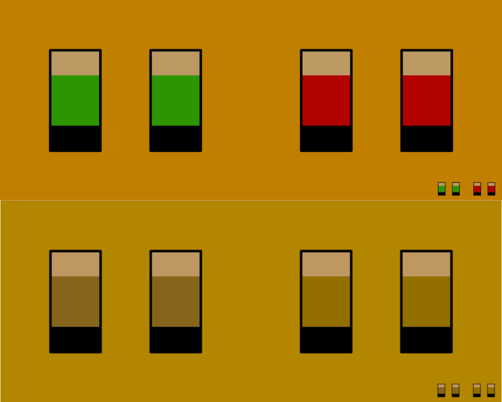
The image has gone through a deuteranopia filter. If you have this problem, you would have a hard time playing this game. Deuteranopia is one kind of colour blindness, there are more. But what is colour blindness? The American Academy of Ophtamology explains it in their website:
Color blindness occurs when you are unable to see colors in a normal way. […] Color blindness can happen when one or more of the color cone cells are absent, not working, or detect a different color than normal.
In our retina we have rods and cones. Rods detect light intensity and cones colour. We have three different types of cones, each one detects one colour: red, green and blue (it is not a coincidence that we use the RGB model). Then, those colours merge in the hue we perceive. Deuteranopia, the problem simulated in the image, has to do with the green cones, they do not work properly.
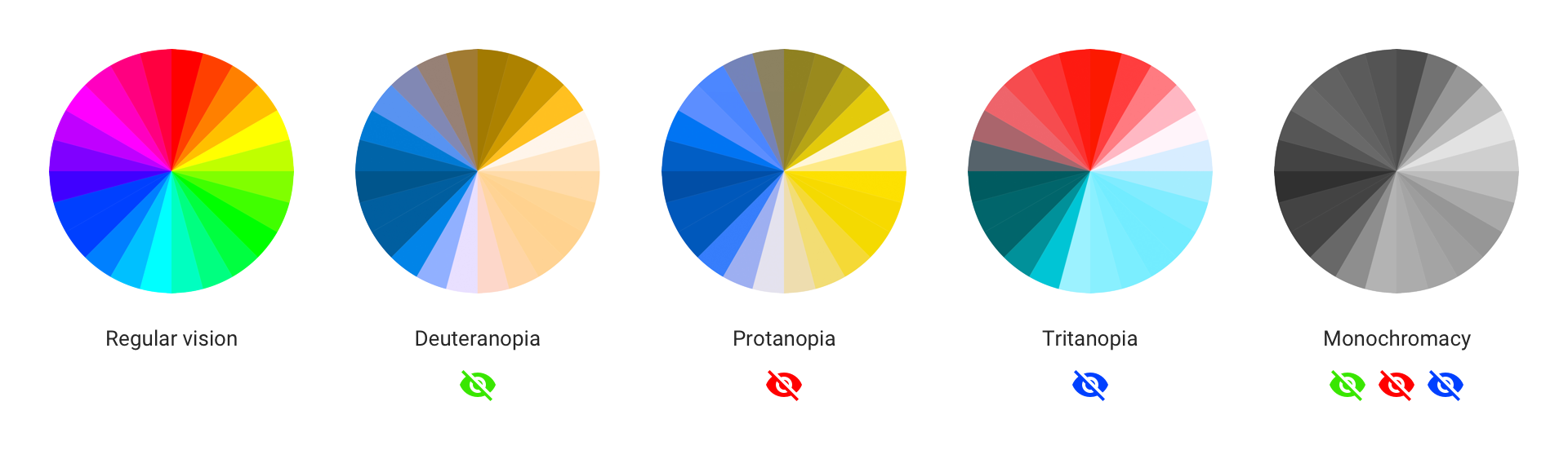
Around 4.5% of the population has some kind of colour blindness. Just in case you did not notice it, 4.5% is a ton of people. The most common of the colour related problems is Deuteranopia (problems with green cones), which results in a similar perceived colour palette to the second most common problem, protanopia (problem with red cones). Usually, we refer to those two problems as red-green colour blindness. Then there is tritanopia, which is really rare (around 1 every 10.000 people) and has to do with the blue cones. The last one is achromatopsia, where your cones are not working at all and you see the life in shades of gray. Thankfully, this one is ultra rare, affecting 1 person every 33.000.
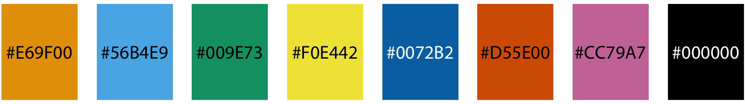
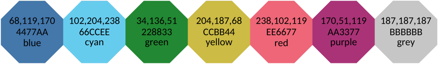
At this point I think you already know how to make it easier for colour blind people to play our games. You are right, with an alternative colour palette. But which one? Don’t worry, there are pre-made accessible palettes. My recommendations are the Okabe-Ito or Tol‘s palettes. Both of them work really well and were created based on scientific evidence. As a curious fact, I will say that the book Fundamentals of Data Visualization published by o’reilly uses the Okabe-Ito palette. Okabe-Ito’s palette is composed of 8 colours while Tol suggests multiple palettes so we can choose the right one for our application. If you have to pick one I encorauge you to visit their posts with a tool to simulate colour blindness (I recommend Spark) and judge by yourself. Personally I prefer the Okabe-Ito one.
I think now it is an adequate moment to make a call to Matplotlib to change its default colour palette.
The ultimate boss when it comes to colour blindness is achromatopsia. No hue at all. I have to admit that this one does not have an easy fix, but since we are here, it is worth it talking about it. The only way to overcome it is not relying on colour, we need alternative ways to give the user the information. If your game uses colour to show things like kinds of enemies or different types of ammo, you might think that this must be impossible. There is a game called Hue which did it, so you can do it too. Another one is Chroma Gun that, you guessed it, is about colours. They just put icons on top of the colours.
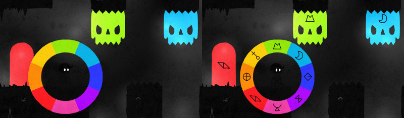
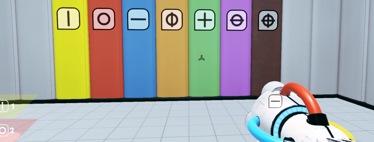
Besides the accessibility, making a game where the only difference is the colour feels really cheap. For example, if your enemy has strengthened and now is different, do not change its colour from purple to red and call it a day. Add some spikes or fire to its design, make it interesting.
Conclusion
If you have reached the end of the post I am sure that you are aware of the importance of accessibility in games. Allowing these people to enjoy our games is the least we can do for them, and, as shown in this post, we do not need to invest exhorbitants ammounts of money or hire a specialist. With something as simple as allowing for an alternative palette and making things bigger we can make our game more playable.
Today we have talked about visual problems, but sadly there are way more. Maybe in the future I make a post about motor disabilities since custom peripherals are an interesting topic. I cannot finish this post without suggesting you the videos from Game Maker’s Toolkit youtube channel about visual, cognitive, motor and auditory disabilities. They are a must. Each video consists in 10 minutes full of useful recommendations with examples of actual games. Also, he makes a yearly review of the state of the accessibility in games.
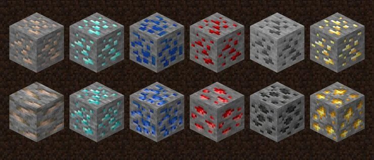
Last-minute news: In the last release of Minecraft, released the 8 of June 2021, Mojang has changed the classic ore textures. The reason is to make the game more accessible. Before all the ores had the same shape and just the colour changed, now the shape is different.
Finally, I leave you with some resources that I find interesting:
-
Three articles from the great blog Rock Paper Shotgun about the importance and difficulties of UI design. Each one talks about a specific game:
-
Level Up – A Guide to Game UI (with Infographic): great explanation about the different kinds of game UI.
-
Games for change student challenge: game accessibility resources: a ton of resources to make our games more accessible. A great place to start our research.
-
Able Gamers Charity: charity whose mission is making games more accessible.
-
The Science of Color Contrast — An Expert Designer’s Guide: concise guide about colour contrast.
-
sRGB, RGB & Gamma: technical, well made, interactive, and easy-to-understand guide about colour properties. It has a chapter about accessibility and colour blindness simulation.
-
How to Meet WCAG (Quick Reference): reference made by the Web Accessibility Initiative.
-
jsColorblindSimulator: the best color blind simulator for images I have found. The only thing missing is the option to download images.
-
Coloring for Colorblindness: amazing post about palettes for color-blind people. It has a colour picker that allows us to create a palette, then it simulates how people with deuteranopia, protanopia and tritanopia see it.